Design Systems & Iconography
Creating & cataloging icon sets, UI components and style guides for use on individual projects and across families of projects. The source of truth for design and development teams to maintain consistency and quality, and to implement designs faster.

My Role
As a lead Visual Designer, it is my responsibility to ensure design quality through the lifecycle of a product’s design and development, and beyond. Creating a library of UI elements, style guidelines and iconography that is easily accessed by designers and developers helps the entire team work easier and faster.
I also develop branding across families of tools, so they are recognized as partner products, but with different functions. This includes not only interface consistency, but app icons for both mobile and desktop platforms.
Below are a few examples of design systems and icon sets I have created for Apple’s internal tools:
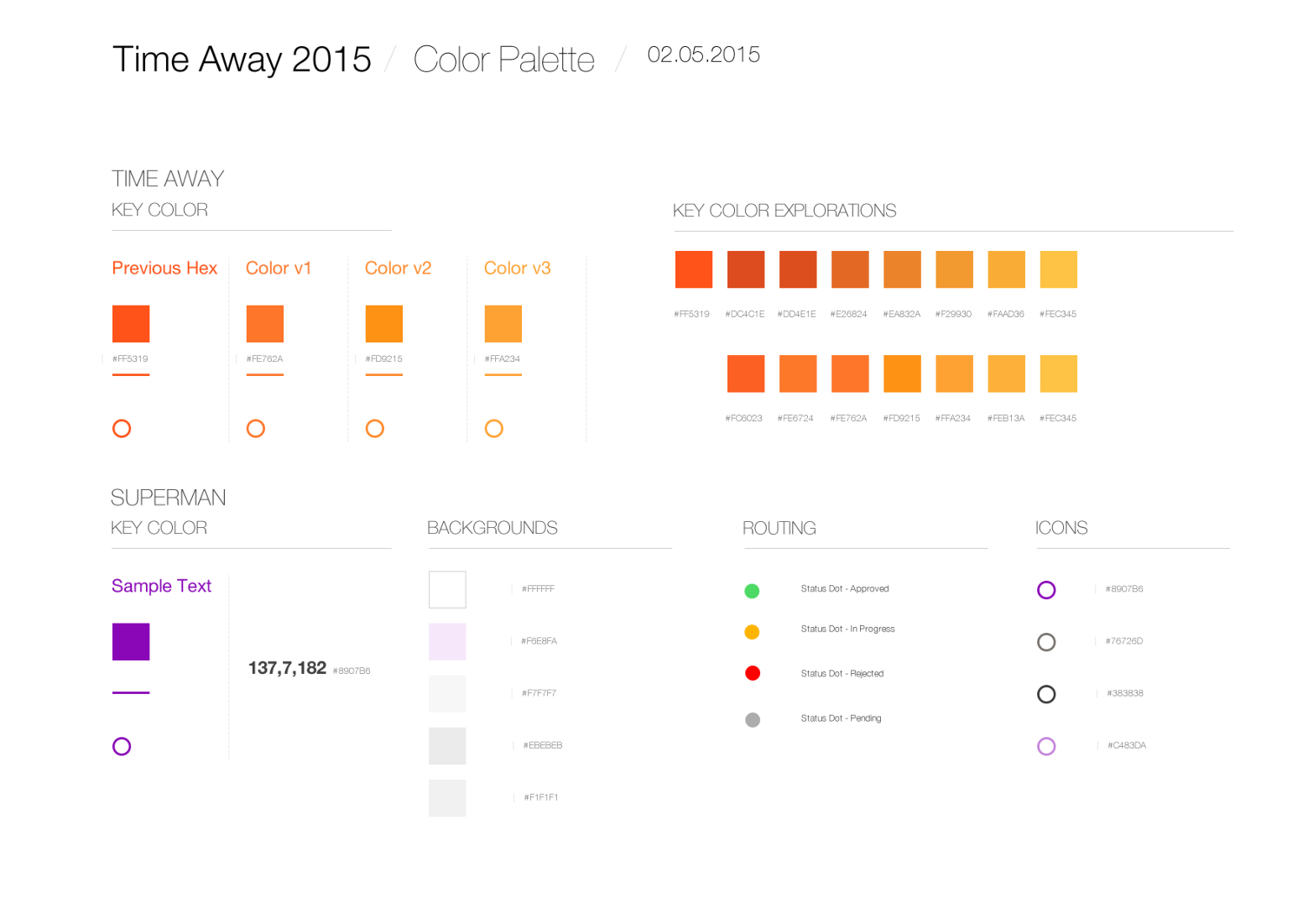
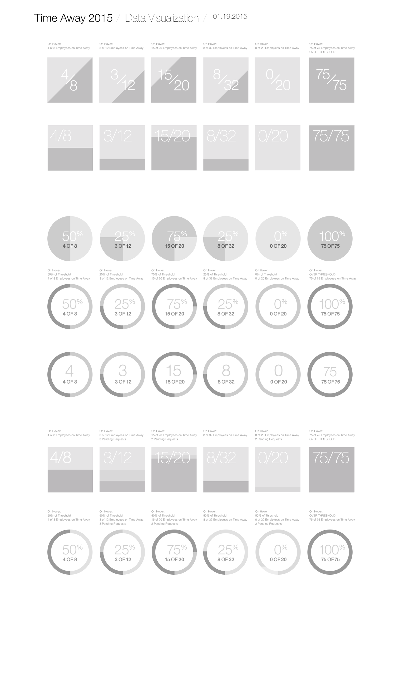
HR Toolkit
A suite of tools was created for Apple HR to help both corporate and retail managers perform their daily tasks, such as tracking & approving time away, compensation planning, talent management, and performance reviews. With multiple designers and developers working on the apps over the course of several years, a branding and design system was required upfront to ensure all the apps had a consistent look and feel, yet with distinct personalities.


IS&T Web Redesign (2015)

MFi (Made for iPhone)
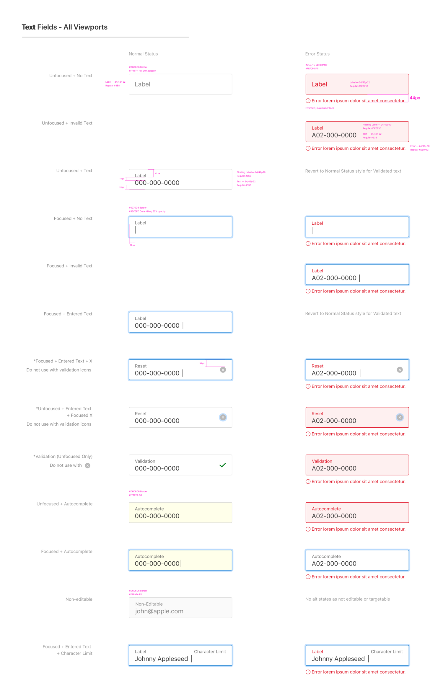
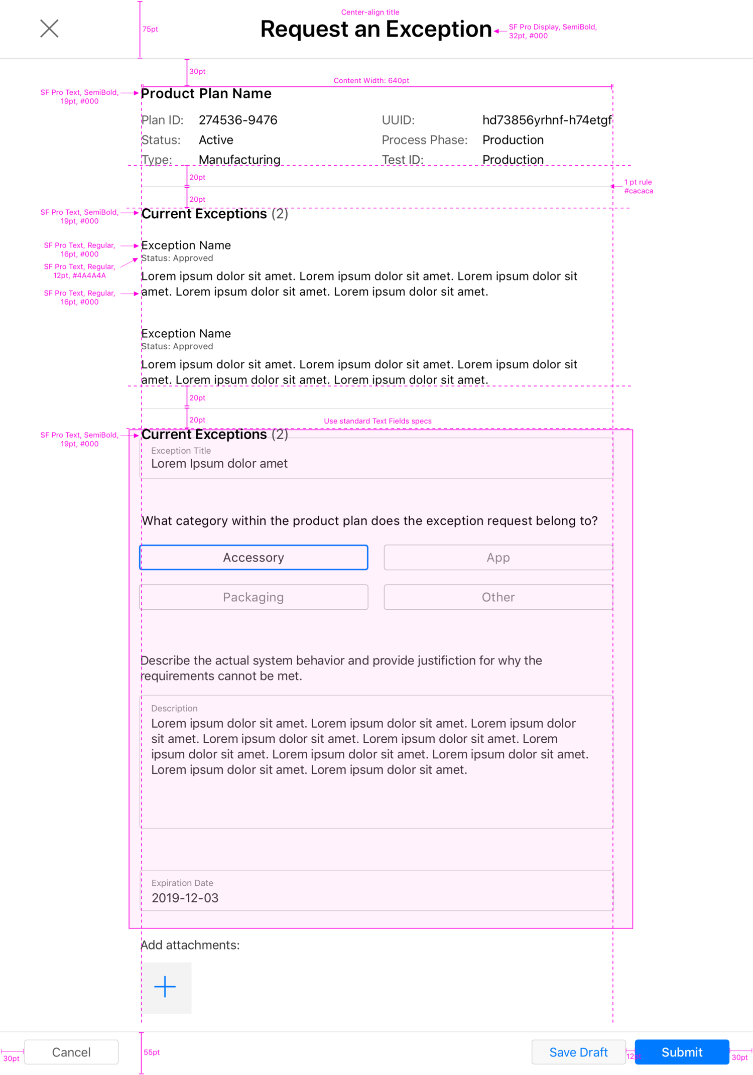
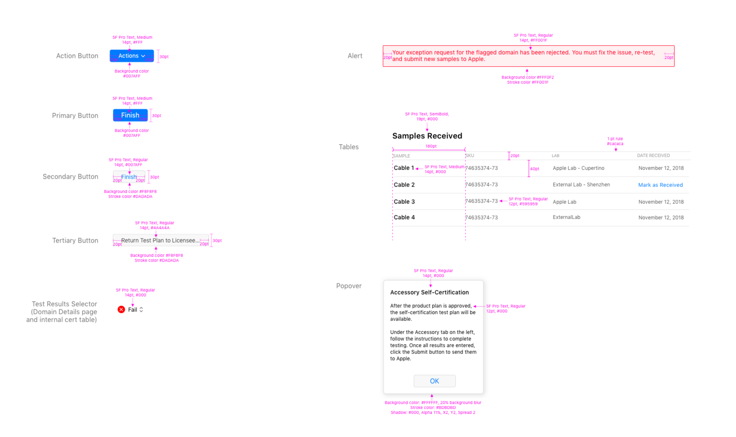
MFi, a tool that allows third-party vendors to certify their merchandise compatibility with Apple products, has a UI that relies heavily on forms, tables and different levels off navigation. Detailed specifications were needed to define the many different types of input fields, their various states, error messages and form layouts, as well as table standards and navigation hierarchy.


Apple Mobile CRM
Mobile CRM is an iPad-optimized app that helps channel and B2B sales reps track their sales pipeline. This project entailed very close collaboration with the iOS developers from the beginning of the design process. By the time the designs were complete, they already had a very in depth familiarity with every screen and UI element throughout the app. They were also very capable with Sketch, so we tried a new way of handing off the specs: Instead of redlining all the spacing, fonts and images, I focused only on the more complex features, and indicated on a separate document which sections of the screens were pixel-perfect. The developer then used Sketch to pull colors, fonts, spacing, and even assets directly from the native file, saving many hours of red lining, exporting, and possible gaps in communication. This proved to be a very efficient and fast way to handoff the designs.


