IS&T Web
Providing tens of thousands of Apple employees faster, easier access to the customer service and productivity tools they need - world-wide, every day.
Shipped 2016


The Problem
IS&T Web is Apple’s internal IT mission-critical hub. From on-boarding new employees, classes and other training resources, software downloads, setting OOO messages, booking conference rooms, filing IT tickets, managing travel logistics, and general company IT news, IS&T Web provides customer service to tens of thousands of Apple employees world-wide every day.
After several years of being developed and grown without UX expertise, users were ore and more frustrated, trying to dig through a very complex and unorganized site to figure out how to do necessary daily tasks. Our goal was to make this process as efficient and painless as possible, by a ground-up overhaul of it’s information architecture, content approach, and visual presentation.
The site also needed a version that was optimized for mobile platforms.
My Role
I was the Visual/UI Design lead on a UX team that consisted of a research lead, three production designers, and a front-end development lead. we had no producer on this project, so I was responsible for planning and coordinating the bi-weekly design sprints, with visual design staggered one week behind the wire framing.
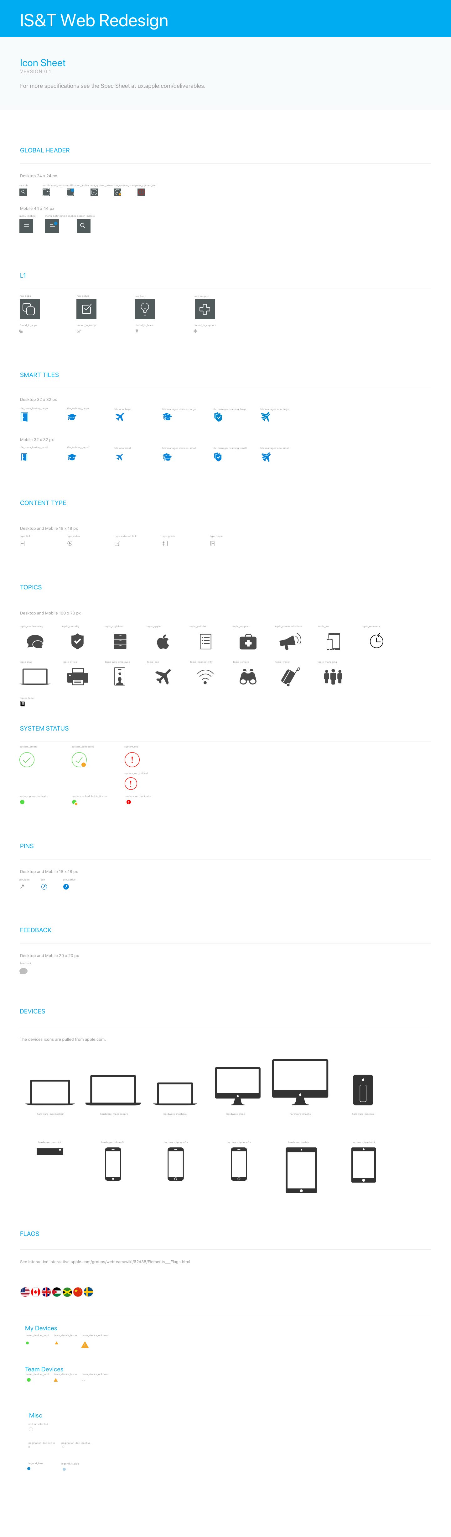
I was also in charge of conceptualizing creating the initial hi-fi mock ups of the visual experience, coordinating and delegating the work of junior designers, and creating the design guidelines and extensive icon sets.
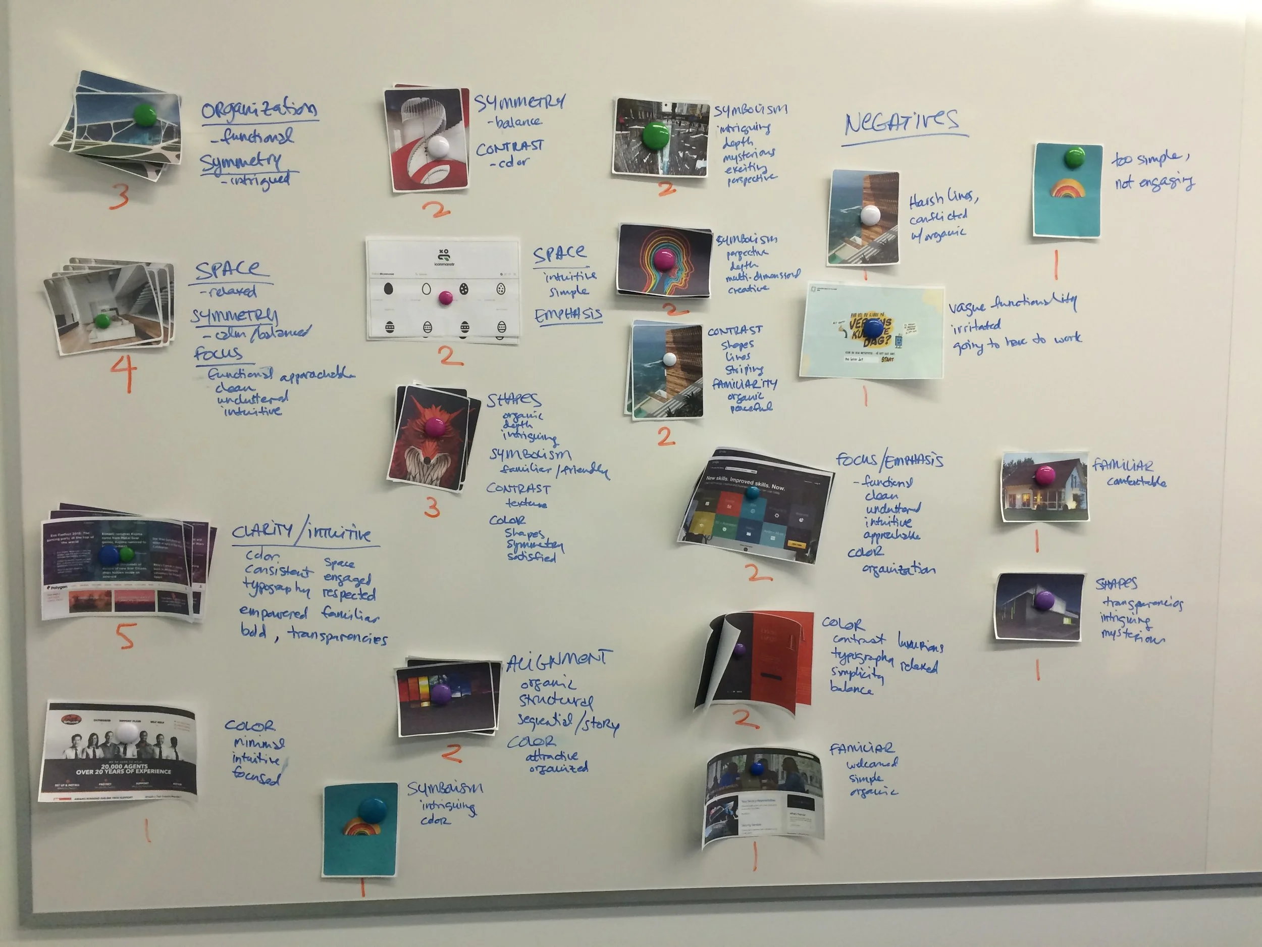
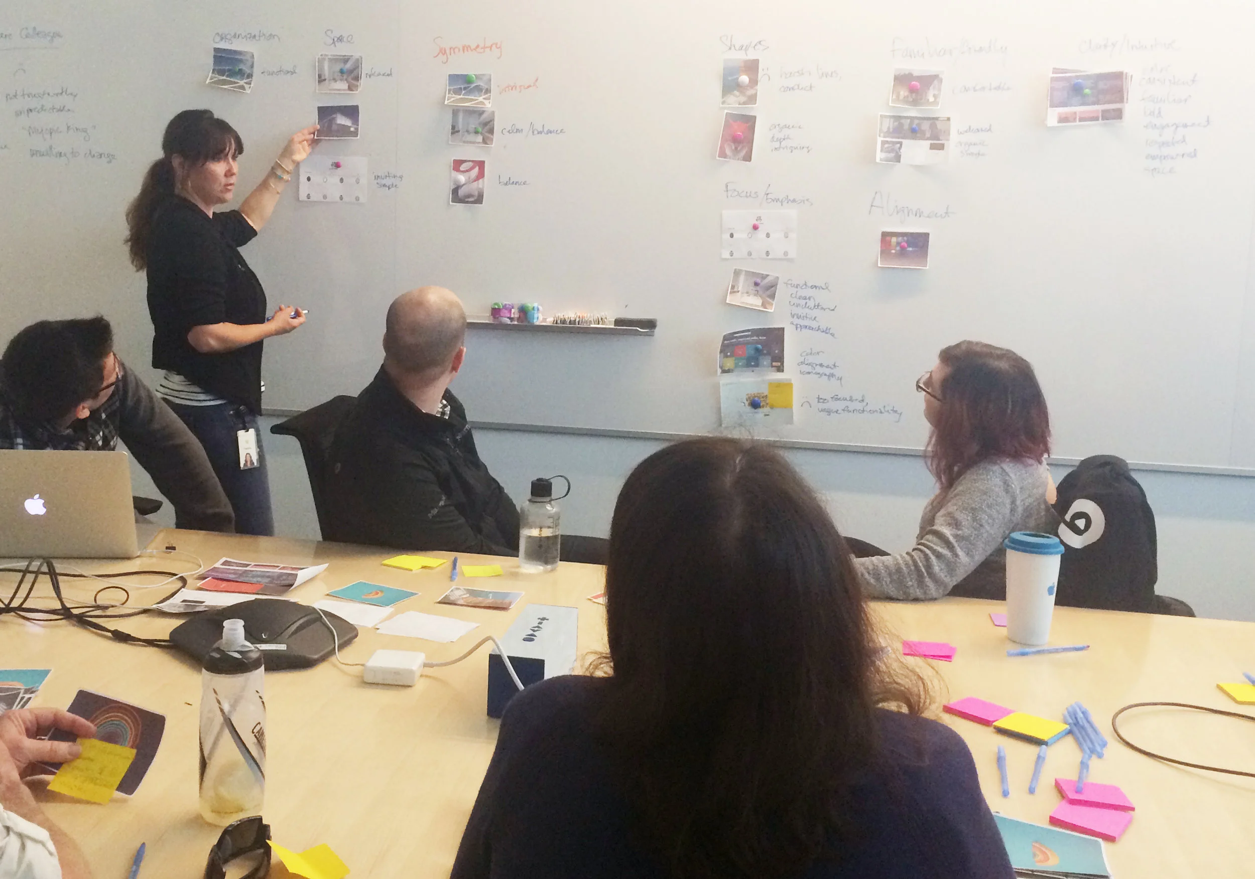
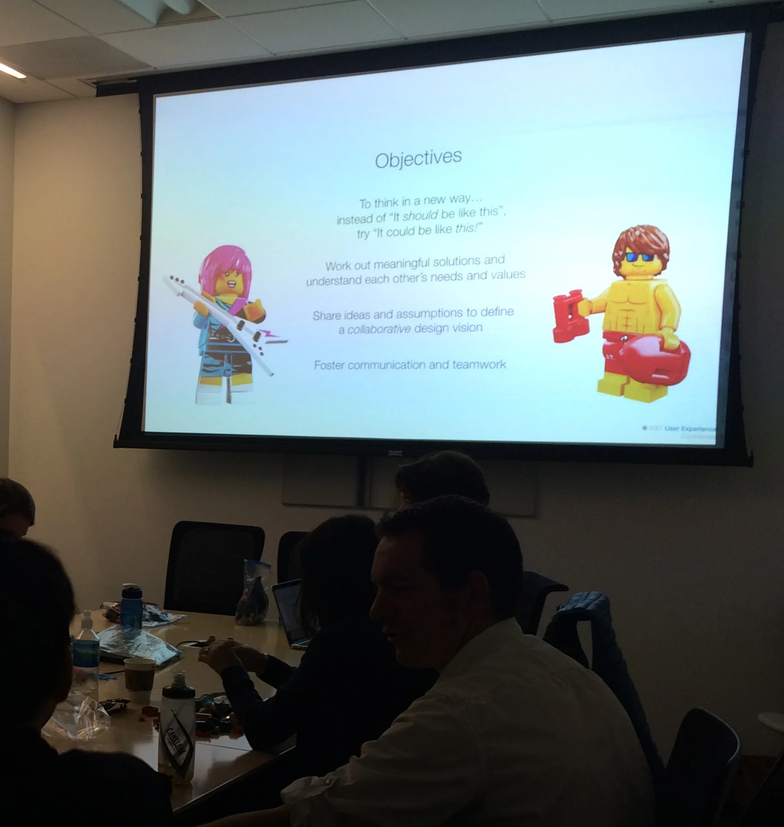
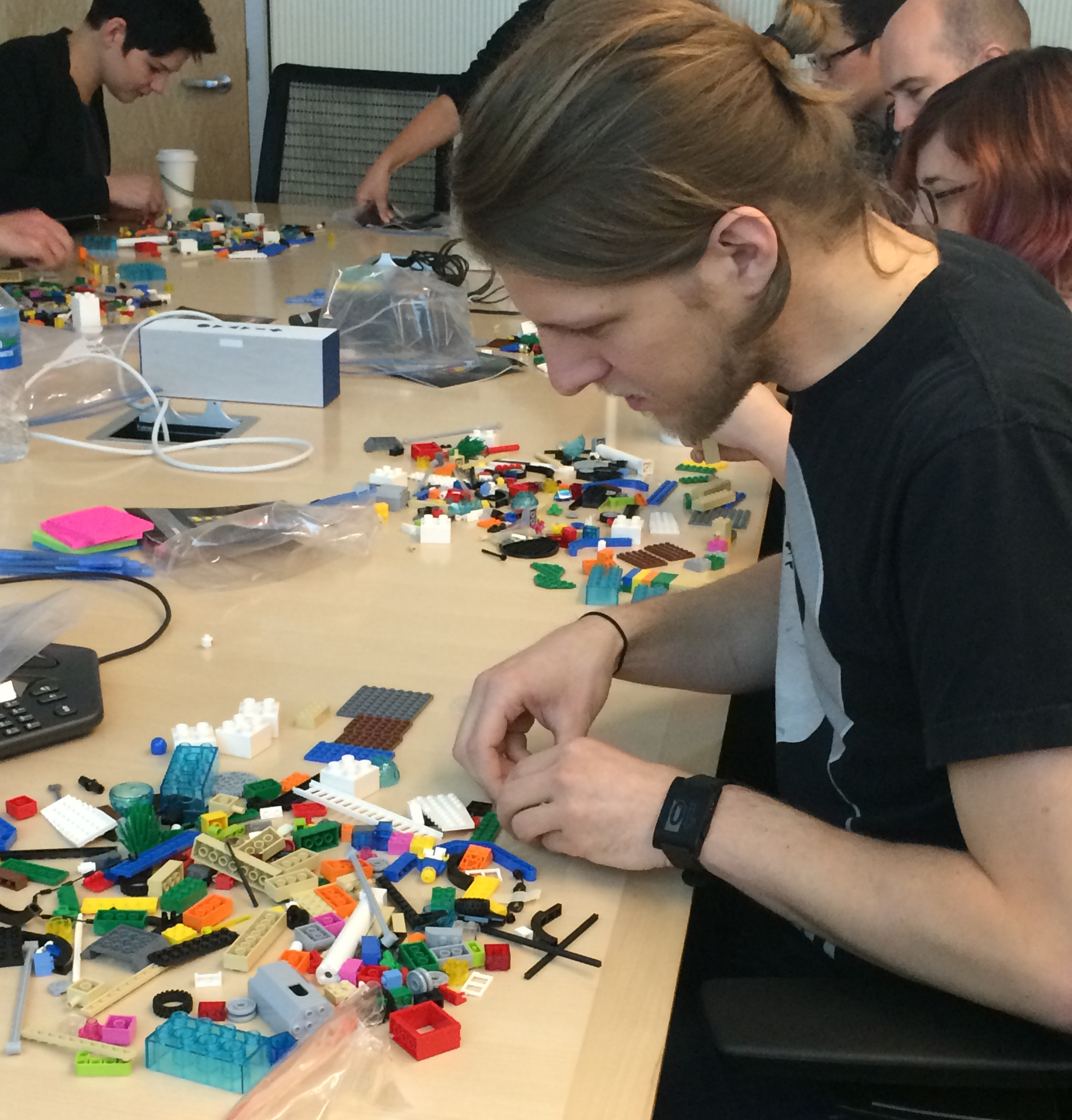
Design & Collaboration Workshop
As part of our initial design explorations, I planned and led a Design Workshop, where a variety of users and stakeholders were able to learn about and participate in the visual design, working collaboratively to contribute to the overall vision of the project.
The workshop started with a short presentation on the UX process, a card sort to explore different aspects and tendencies in visual design, and a Serious Lego Play collaboration exercise. This helped to foster trust between cross-functional product groups, and allowed users to be directly involved in the design process.
Design Explorations
During the usability tests we saw several participants use browser bookmarks for quick access to their most-used content, but those became quickly lost in the jumble of other bookmarks. When asked to perform certain critical tasks without bookmarks, users were often unable to complete them on their own. Because there was so much required content throughout with many different kids of users, we knew we needed some kind of favorites/pin/bookmark system embedded in site so users could organize and curate their dashboard with only the information they frequently accessed.
We knew from our initial research that there were four primary tasks employees came to IS&T Web to do: Setting OOO status, booking conference rooms, downloading software, and IT support.
We also wanted to offer a very robust search functionality, so users could quickly find less-used content.
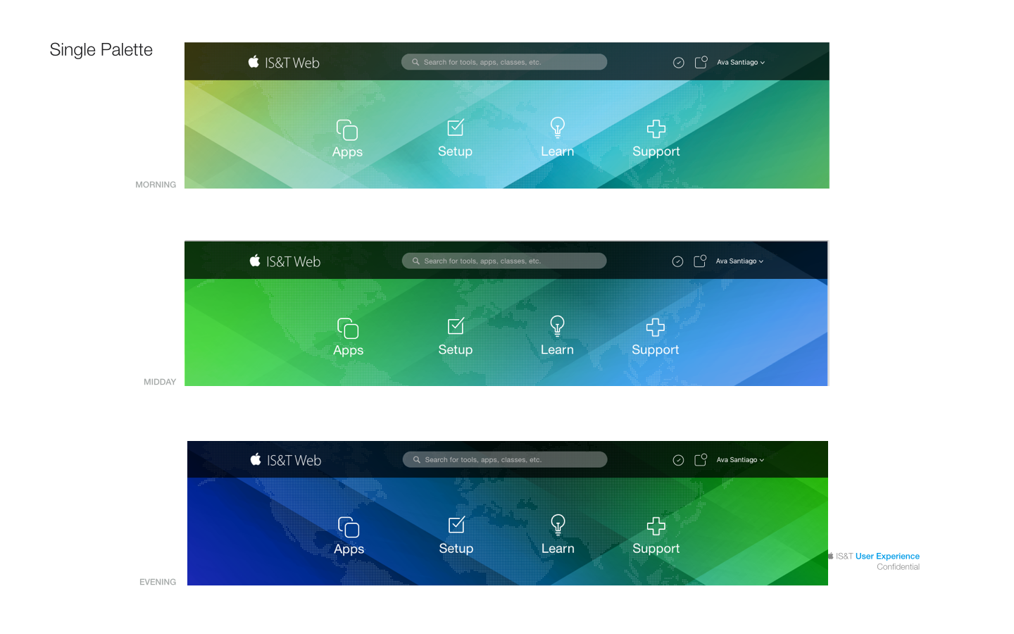
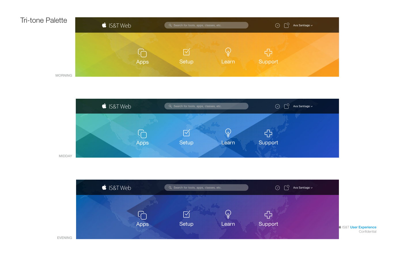
Because of the new, user-focused nature of the design vision, we wanted to take that a step further with a personalized greeting, and a header graphic that adapted to the current time zone of the user.
Other dashboard requirements were established by stakeholders: A news feed, system status alerts, and quick access to training and classes.
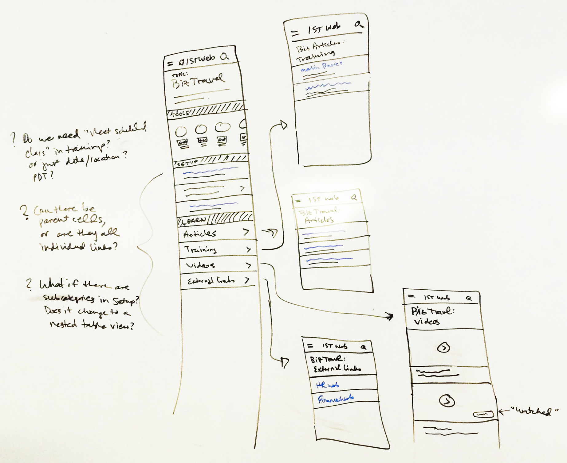
Sketches & Wireframes


Hero Iterations
High-Fidelity Mockups


Design Systems


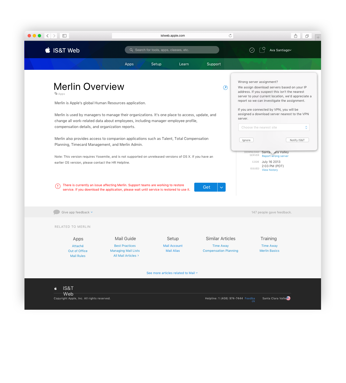
Final Solution
With the new IS&T Web, tens of thousands of Apple employees have faster, easier access to the customer service and productivity tools they need - world-wide, every day.