Mobile Genius
Tracking and processing repairs on Apple devices around the globe.
Shipped 2013

My Role
The UX team consisted of a researcher, two UI designers, and me leading the visual design. My role was to reconceptualize the visual experience, and bring the design up to date and into alignment with the current iOS look and feel.
*Note: This design was in progress just before iOS 7 was released, and we didn't quite know the new direction of Apple’s design standards… much of the visuals for this project reflect our best guesses.
The Project
Mobile Genius is the iPad app used in all Apple stores globally to process in-store repairs to Apple devices.
Specialists at the Genius Bars in Apple Stores need a way to track the repair history and progress on individual devices brought into the Genius Bar. Often times the serial numbers were not registered, leading to possible repairs of stolen devices. The functionality and visuals of the existing system were very outdated and only web-based, so needed to be aligned to Apple’s current design standards and redesigned for the iPad platform.
The final user flows, UI features, layout and visual design were a product of weekly team design reviews with the UX team, stakeholders and engineers, as well as daily stand ups and constant collaboration.
I was involved in extensive user testing both in stores and at Apple's research labs, held ongoing design reviews with the business side and internal UX team, and interfaced with XCode and Objective-C developers to ensure design fidelity.
Since this is a globally used software with a web-based version, localization and scalability were also top priorities.
I designed and delivered hi-fi mockups, a style guide and icon set, highly detailed visual specifications, and all final assets to the development team, collaborating during the entire development process to ensure Apple-standard design fidelity in prototypes and the final product.
Mobile Genius shipped in 2013, and is still in use in all Apple Stores today.
Wireframes

The home screen includes a search, a side navigation to access different areas of the app, and a scrolling bar below to directly navigate to repairs in progress.

Once in a specific repair, there is a collapsible side panel to show the repair history of the device.

Tapping the device icon in the header bar, the user can access the details of that specific device.
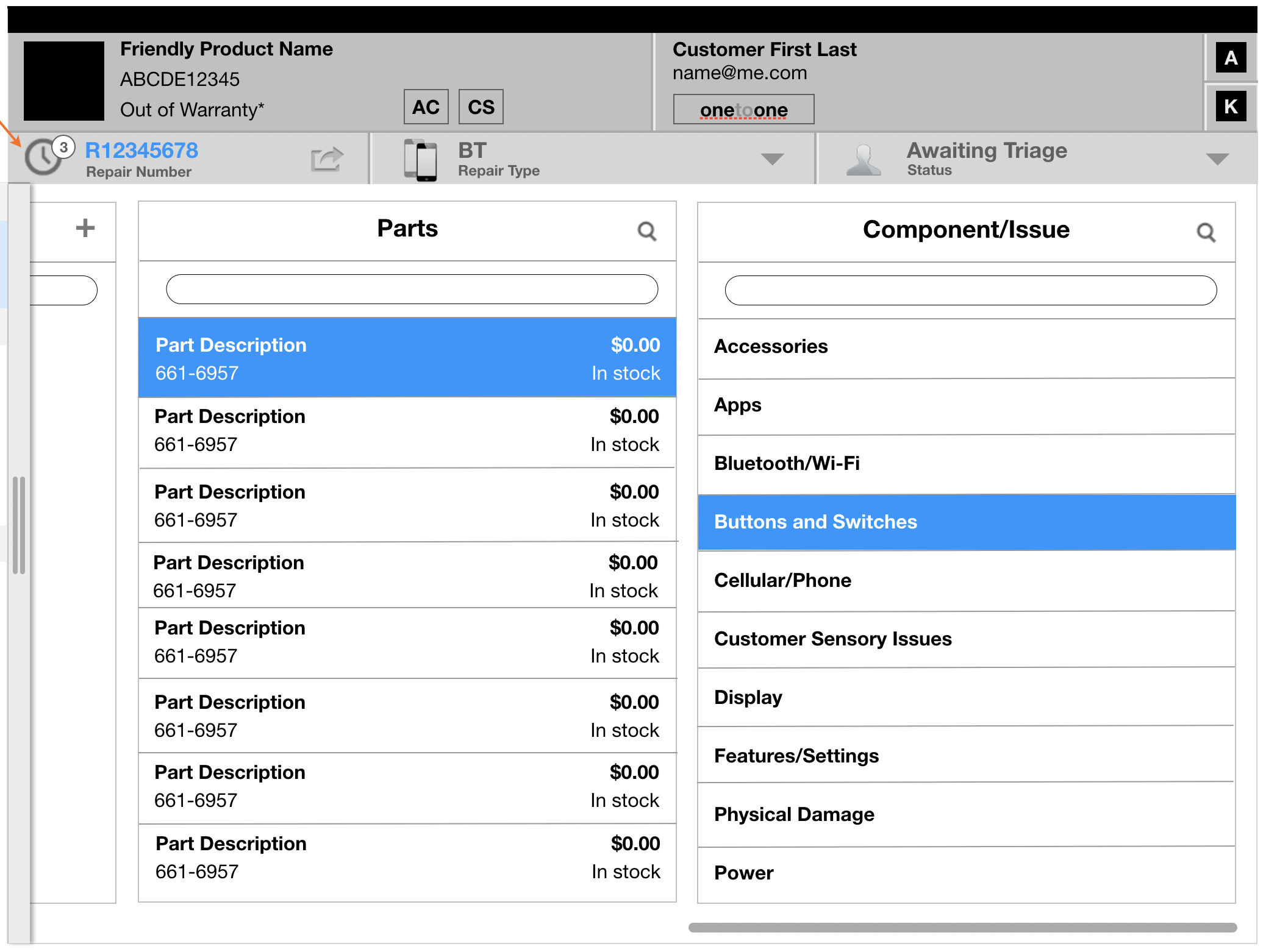
Badges and icons bring the user’s attention to unread alerts and actions pending.
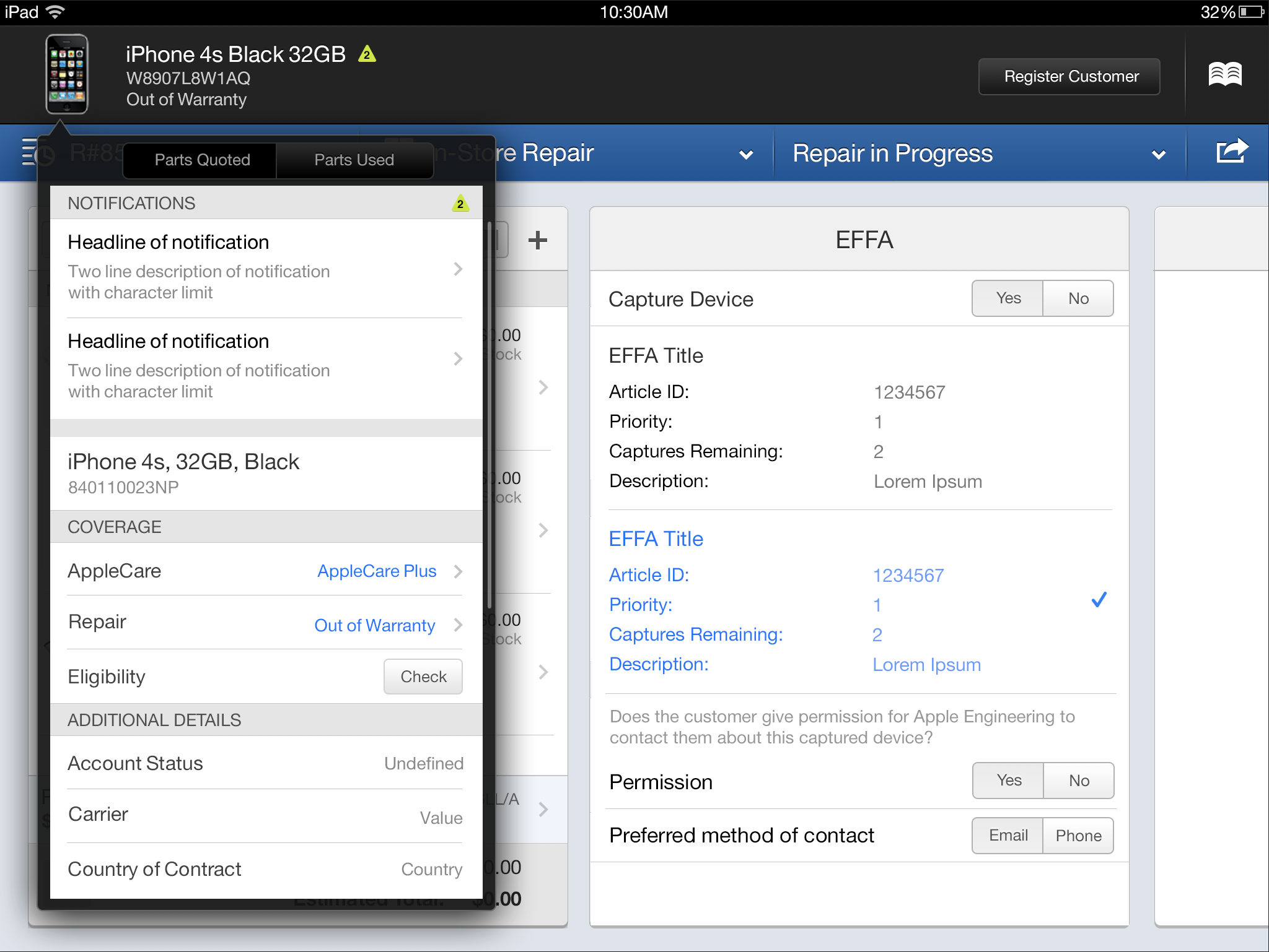
High fidelity mockups
Based on the wireframes, the designs were brought to life and further refined by adding color, iconography, font treatments, and spacing. During this phase, there were additional adjustments to the UI based on issues not visible until the visual design was developed.


Specs and Iconography
As part of handing off the designs to the engineers for development, I prepared extensive specs to ensure design fidelity, and created a set of icons.


