Roku Customer Support Site Redesign
Understanding how users think about Roku products, and how we can help them self-solve common and edge-case issues.
Shipped Spring 2021
Good customer support is crucial to maintain user trust and loyalty to any brand, and the delight they feel when using the products.
The Roku support website had serious usability issues. With no UX designer, it was a confusing and ineffective collection of FAQs and videos, that was not organized in a way that helped users to find solutions to their problems.
Working closely with cross-functional partners, I led the end-to-end redesign of the Roku Customer Support website from the ground up.
Starting by defining the needs and problems of both the business and the users, and through extensive and thoughtful user research, we developed a phased approach - homepage, search results, contacting support, and personalization with machine learning - providing the flexibility to drive the designs forward and also be agile in our progress as business and user needs change.
My background in visual design and keen eye for aesthetics supported the final product: a modern, easy-to-use, empathetic and personalized help experience.
Primary skills & achievements
• UX, UI & Visual Design for the Roku customer Support website redesign
• Presenting UX leadership design reviews, and share-outs with non-designer partners (C- & VP-level executives, stakeholders, engineers, etc)
• Contribution to corporate design systems, pattern libraries and icon sets to be used across platforms and products
• Close collaboration with business partners, engineers, researchers, UX writers, design peers and leadership, accessibility, prototypers and data visualization artists
• Accurate and viable scoping, roadmapping, project planning, and documentation.
• Prep and delivery of specs and assets to the development team, with ongoing UXQA and tight collaboration with engineering to ensure design fidelity in final product
• Mentoring and coaching junior designers
The Problem
Per 2019 Consumer Insights, 72% of support site visitors could not find what they were looking for or solve their issue, resulting in user frustration, higher demand for agent support, and/or abandonment.
This high failure rate drives unnecessary agent support costs… if we did nothing, this cost will increase each year as the business grows, as well as decrease user trust and loyalty.
How might we improve the support experience to help users find solutions more quickly and efficiently, and reduce agent contact costs?
Discovery
Early on, we did not have a dedicated researcher, so we relied on the expertise of the PM and myself to dig in to the problem with home-grown guerrilla research with peer interviews. We asked them to perform typical tasks on the existing support site, and took notes. I then used those notes to create rough journey lines on a white board (which I later digitized), to help visualize the experience and identify common stumbling blocks.
Pain points
Lengthy, content-heavy articles
(“ I don’t need all this info, just give me the answer”)
Unintuitive browse experience
(“I have no idea where to begin”)
Poor search experience
(“These results don’t seem relevant”)
Frustrating contact experience
(“Why do I have to answer all these *%&!^ questions??”)
Multiple approaches to problem solving
(“I don’t like to read” “I like reading” “I hate videos”
“I prefer watching a video” “I just want to talk to someone” “I hate calling customer support lines”) 🤯
Low awareness/trust of Roku Community
(“I didn’t even know there was a Roku Community”)
Personas
Based on our peer interviews and previous Customer Insights studies, we determined three very different core user types:
User Journeys
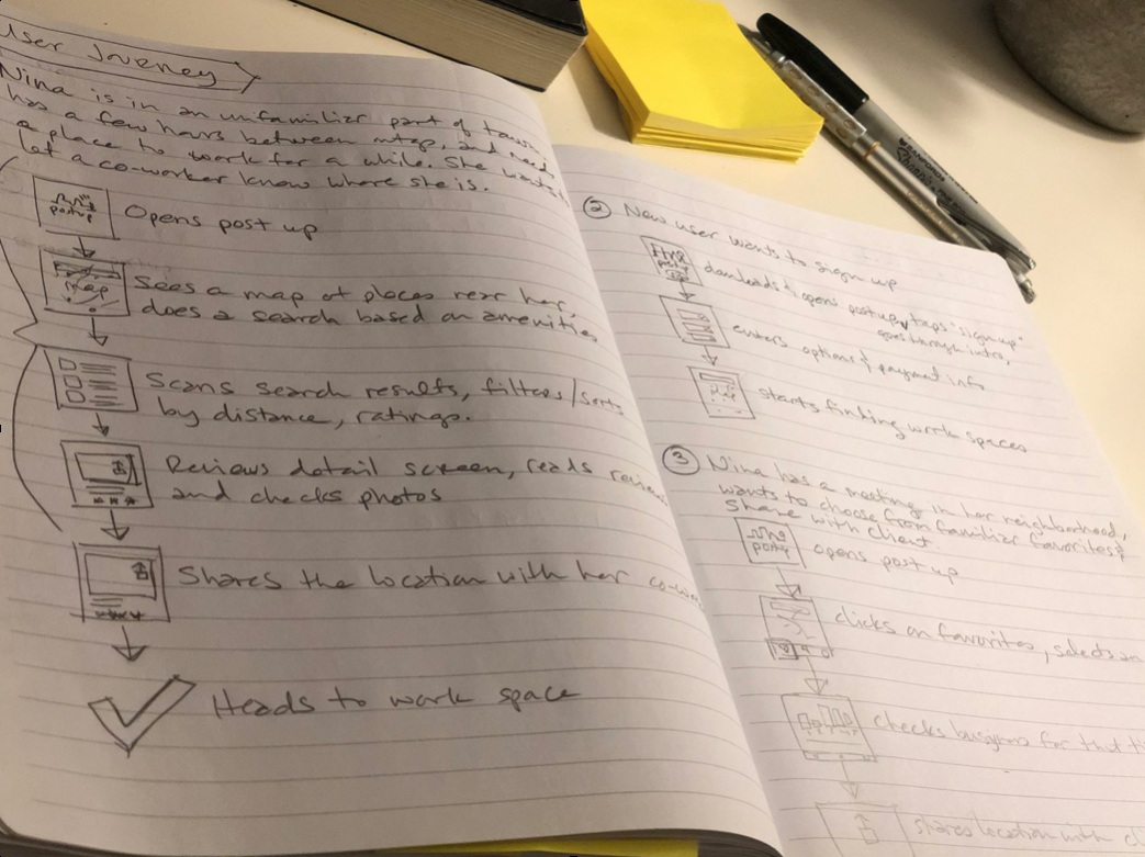
Putting myself in the users’ shoes, I created a few typical user journeys to get a sense of the steps they go through while needing support - What are they thinking? Feeling? Doing? Where are they? What device are they on? Where do they get frustrated? What content do they need on each screen along the way?
So how do users think about their problems?
Armed with a solid problem statement and hypothesis, I started working on the site architecture and improving the categorization, by figuring out how users actually think about their problem. In March 2020–hello Covid!– suddenly we were unable to see our peers, visit users’ homes or do any kind of extended in-person testing. So I relied on friends and family in my bubble, of different ages and technical savviness, with mostly analog tools, to perform card sorting exercises.
Key Research Takeaways
Some users are device-centric, others focus on the actual problem
Some people like watching help videos, others want to read an article
Some trust forums, others want to call official Roku support
Most people will search or call support before browsing categories
80% of customers call support for the same 6 - 10 issues
Design Goals
Based on those very different approaches to problem solving, I determined four key goals for this project:
“If we provide most relevant content up front, provide multiple paths to solutions, and make it more intuitive and streamlined to browse, then users will solve their problems more easily and quickly, stay loyal to Roku, and business costs will be reduced.”
Information Architecture
I began exploring different ways to organize the content on the site, and drew out flow charts…
…and boiled it down to three possible IA concepts - mild (MVP, low risk, low effort), medium (more impact, more risk, but doable), and wild (high impact, more risks and unknowns). I evaluated each concept and proposed a champion to recommend to UX leadership and project stakeholders:
Design
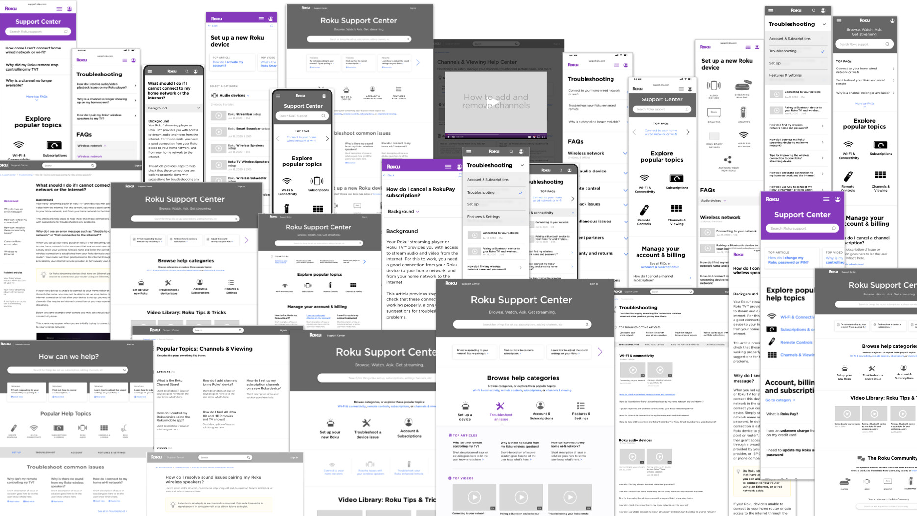
Having solid data to back up my design decisions, I dove into wire framing. Many, many, many wireframes!
There were so many possible ways to approach these set of user needs. I was also managing multiple stakeholders with differing metrics for success and opinions on design, changing priorities, and inconsistent resources.
I needed to stay flexible and diplomatic, while doing some strategic influencing, and always going back to the user needs - solutions, options, simplicity.
Prototype
I refined the wireframes and created a click-thru prototype in Figma. I had explored iconography and different visual treatments, but all that was still in the early stages.
At this point we were able to get 50% of a dedicated researcher’s time, who helped plan and conduct a formal usability study.
Since most customers are using phones when they visit the Roku support site, we tested a mobile prototype in moderated sessions with about 16 real-life users.
Users were very happy to know there were help videos, and the icons in general helped users scan content more easily.
Meanwhile, despite our efforts to simplify while still providing enough information, the categories were still not quite intuitive, users still felt overwhelmed and needed to scroll around to find the right path.
Final Designs
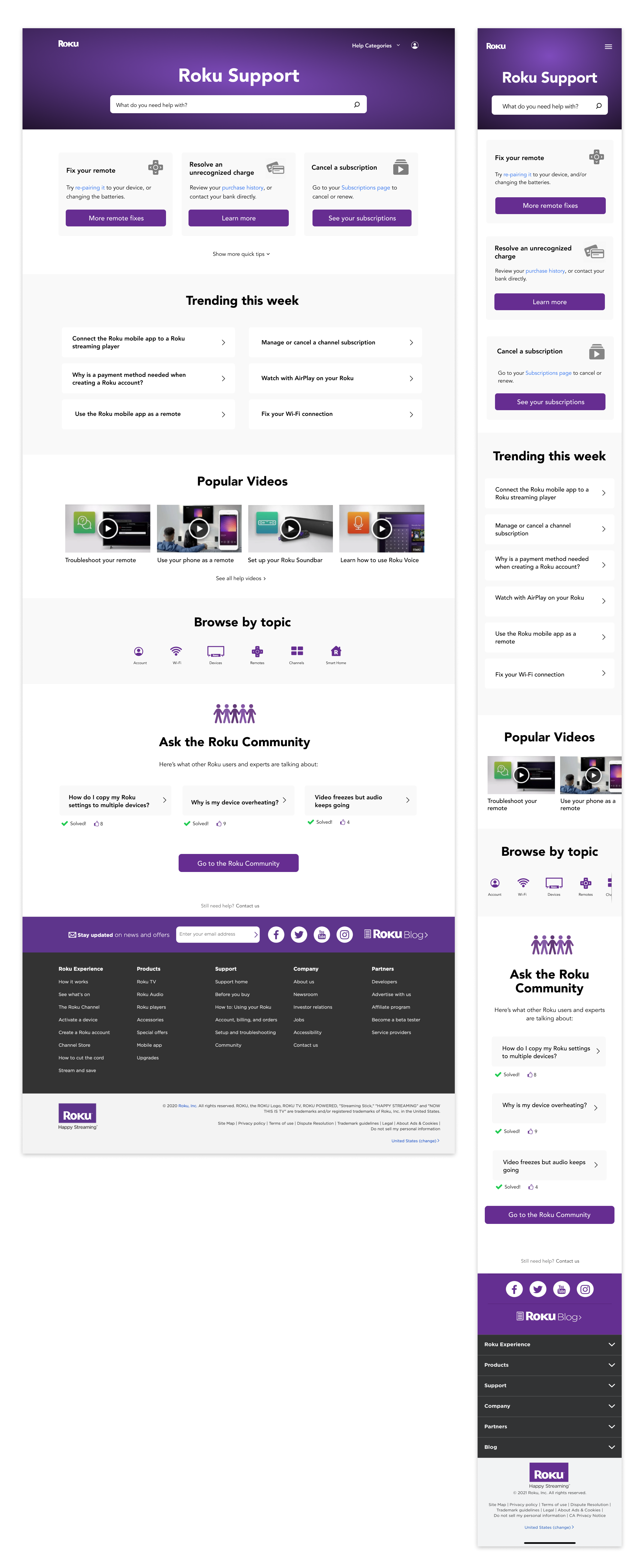
Based on all of my learnings, I finalized the design of the home page.
Search remains at the top, with a customized global header and a new, clean, on-brand gradient background.
We know that ~50% of our customers visit the support site for the top 6-10 issues, so the answers to the most common problems are provided above the fold, with direct links to the solutions.
Additional common topics, based on weekly analytics, are also shown with direct links.
The video library is now showcased on the homepage, with the browse categories minimized but still available.
Also showcased in the Roku Community. We explain what it is, why it is helpful, and offer some sample issues that have been solved and “liked” by the community.
All of these changes help to reduce the need to dig around for solutions, allowing customers to solve their problems on their own, reducing the calls to customer support and thereby reducing business costs.
More elements of the design
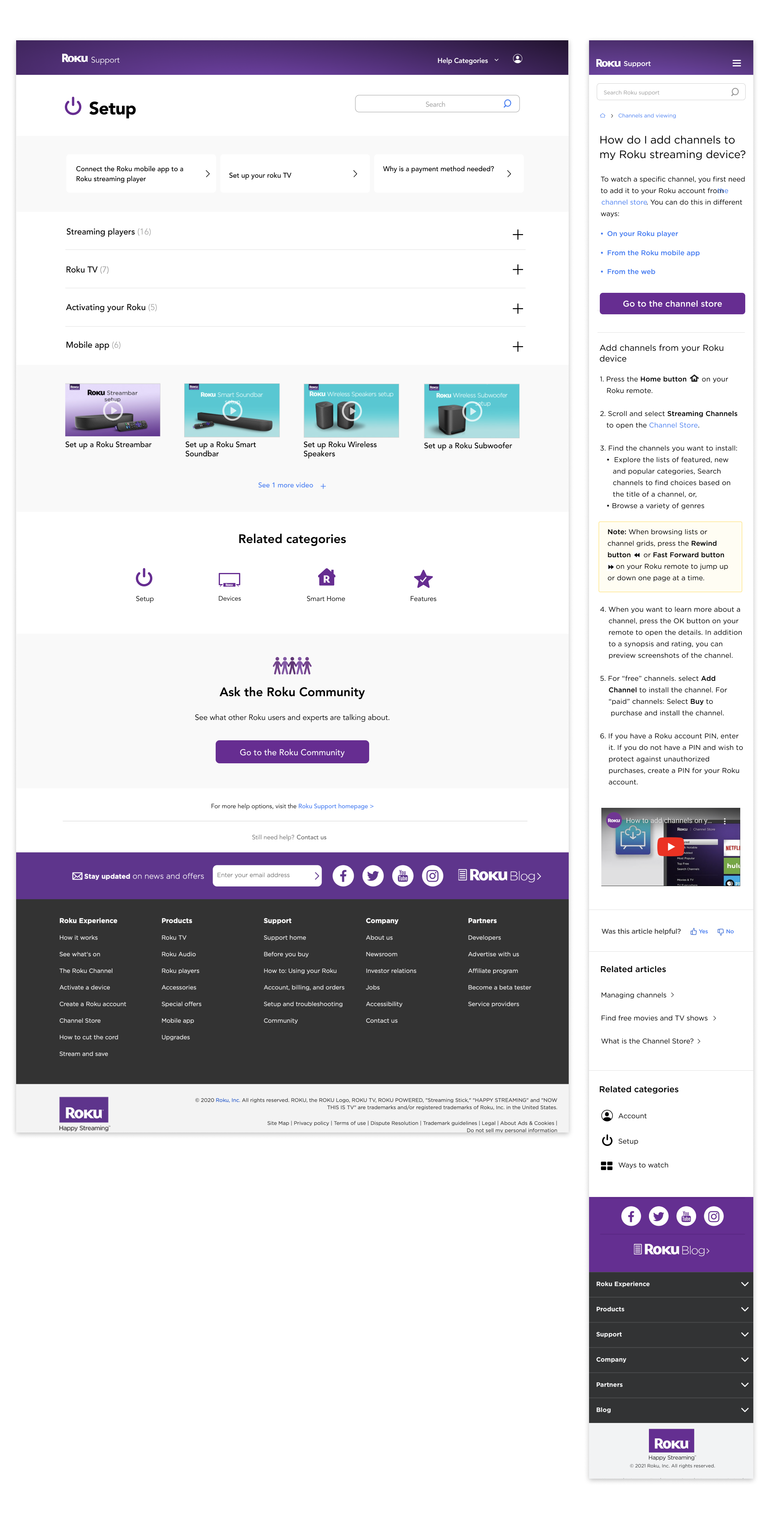
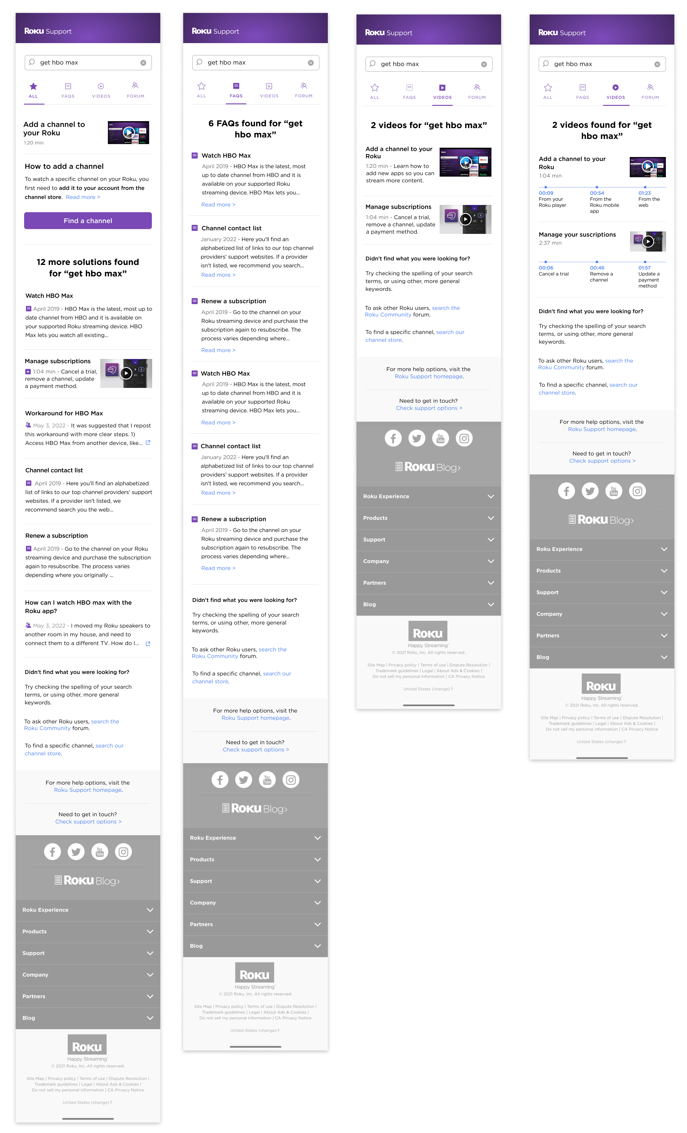
In addition to the homepage, I also redesigned the category landing pages, and the FAQ template:
A key piece of the wholistic experience was improving the search results. This went through all of the phases of discovery, design, research, and executive reviews, and was well-received by users in testing, however was temporarily re-prioritized by the development team, so did not launch with the larger project.
Results
We conducted a post-launch usability test, using the same tasks as in the original baseline study. Here are the some quotes from the test read-out:
🎉 “The newly redesigned CS site is a considerable improvement”
🍾 “Success rates increased for almost all tasks”
🤔 “Some nomenclature continues to be confusing - ‘channel’ vs ‘app’, ‘audio’ vs ‘sound’…”
😅 “… but visual elements (icons) in the UI, and the links to direct solutions, help to alleviate that confusion”
Summary and Next Steps
What if we knew what the user’s problem was before they even came to us for help? What devices they have, and if one of them is not working properly? What apps or subscriptions they have recently added, and may have questions about? What accessories they have connected, and what other products may enhance their home cinematic experience?
We are currently exploring machine learning to bring our customer support experience to the next level.
In the meantime, I learned a lot during this project:
⚖️ With so many different user types, it’s important to determine the right content to help most users, but with out overwhelming. And when you think you’ve simplified as much as you can, simplify even more!
🤸🏾♀️ This was a very large, complex project with many moving parts and changing targets, that spanned over a year. A lot changed during that time, and I needed to remain agile, while keeping the ball rolling and driving the project forward. This required a LOT of flexibility and communication to keep the project going as smoothly as possible.
📑 With a project of this length and complexity, it’s easy to forget why certain decisions were made. Thorough documentation and a change log are indispensable.
💪 With no initial research budget, I led most of the early discovery for this project. Research is not my area of expertise, yet I was able to gather a lot of relevant and useful data to inform the design direction. I learned to have the self-reliance and courage to try something I wasn’t familiar with, and trust in other members of my team to do the same.


