RunBuddy: A Case Study
Redesigning how users rate, review and choose local run routes.
Overview
RunBuddy is an iOS and Android app that helps runners find great routes for their next run. Runners can see routes that other users have ran, choose a route to run, and create a new route. Routes can be rated and reviewed using a 5-start system.
The Problem
After a user finishes a run, they can rate their run. Other runners can see this rating, and use it to help them choose their next run route. The current version of the app uses a 5-start rating system. Many users have complained that this rating system is not helpful for them to find a new route to run, because it is not specific enough on details of the route — lighting, traffic, safety, hills, etc.
My Role
This case study highlights the wholistic process I went through to design a solution for this problem - redesigning the rating screen. After learning the needs, behavior, and pain-points of runners, I designed a prototyped solution, and created the final high-fidelity mockups. In addition, I designed the RunBuddy logo and app icon.
Research
User Interviews & Synthesis
Persona Creation
Competitive Analysis
User Journey
Ideation, Validation
”Crazy 8” Rough Sketches
Refined Sketches
Interface & Visual Design
Wireframes
Final Hi-fi Mockups
App Icon & Logo Design
Persona: Meet Gabe
Behavior
Gabe is an avid runner, and is always looking for new routes around his city, but wants to make sure they meet his fitness level, are safe, and not too crowded.
Frustrations
Often times Gabe ventures out on a new running trail, just to find it doesn't have the hills to challenge him, or that there is a lot of traffic, or that it is not well-lit in the evenings. Or maybe it’s just the same boring scenery. Gabe regularly uses the RunBuddy app to look for new routes, but the subjective 5-star rating system does not give him enough details to know if a route meets his particular needs.
Goals
To make sure he is getting the most out of his run time, Gabe wants to know the specific details of the run — is it challenging, is there a lot of traffic or other obstacles, is it well-lit (safe) in the evenings, is it scenic or otherwise interesting? He needs to know this level of detail before he sets out on his run.
User interviews & synthesis
"What factors do you consider when deciding where you’re going to run?"
"I’m more of a beginner, so I really like to know how difficult the routes are. For example, is it mostly flat? Are there lots up uphill sections?" - Jessica
"When I plan a route to run, I look at how crowded the areas are that I’ll be running through. If it’s too crowded with other people or cars, I can’t keep up my momentum. But if it’s a remote area of the city, it just doesn’t feel safe. I try to find a happy medium between the two." - Marina
"I run at night a lot, and my main priority is safety. I like to see how safe a route is, and let others know the same." - Monika
"I run in the city, and the main thing I care about is avoiding really busy streets! Crowded areas can really slow down my momentum." - Lina
"The whole fun of running outside is getting to see new sites and areas! I would love to know about routes that take me past some great scenery - and if there’s a coffee shop at the end, ideal!" - Gabe
"I would love to explore some new routes, but I don’t want to be surprised if it’s way too difficult for me." - Ian
“Sometimes I want to push myself a little harder, so I try to plan out a more difficult route with a few more uphill sections.” - Amie
1. Is it safe? Well-lit, not too remote…
2. What is the difficulty level? Hills, terrain…
3. Is it crowded, traffic, congested, other obstacles?
4. Is it scenic, are there amenities such a restrooms, coffee shops…?
Competitive Analysis
To start exploring solutions for our user needs, I looked for other apps that rely heavily on features like route attributes, ratings & reviews.
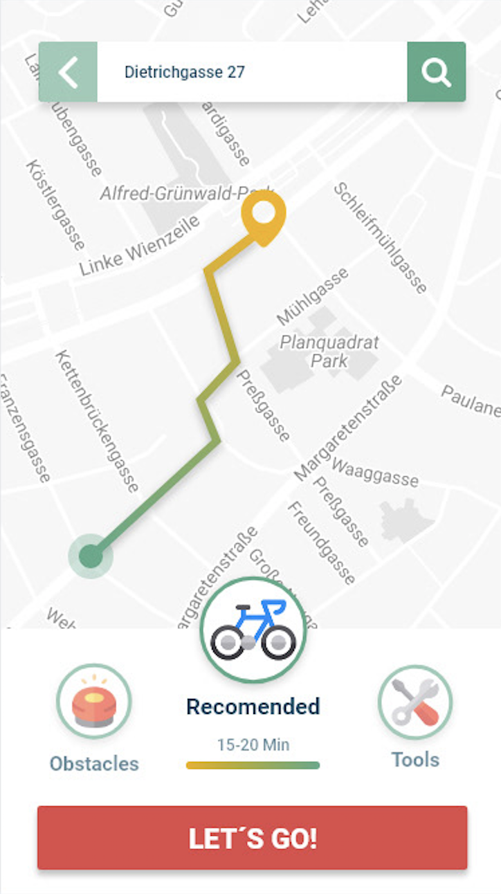
Taggly: Bike Route Details Screen
Taggly shows the duration, obstacles and other details of the route upfront.
This could work well for RunBuddy, since users can quickly know the difficulty, safety, and crowdedness of a route.
Taggly: Rate Prompt Screen
Taggly prompts the user to rate a run immediately after the user is done with the route.
RunBuddy could use a similar prompt, but focus on tags, not subjective ratings.
Workout App: Attribute Selection Screen
This workout app allows the user to select attribute tags of a workout based on difficulty, duration, type, etc.
RunBuddy could use a similar tagging system to allow users to “rate” a route objectively, rather than subjectively, since one runner’s preferences may not be the same as another’s.
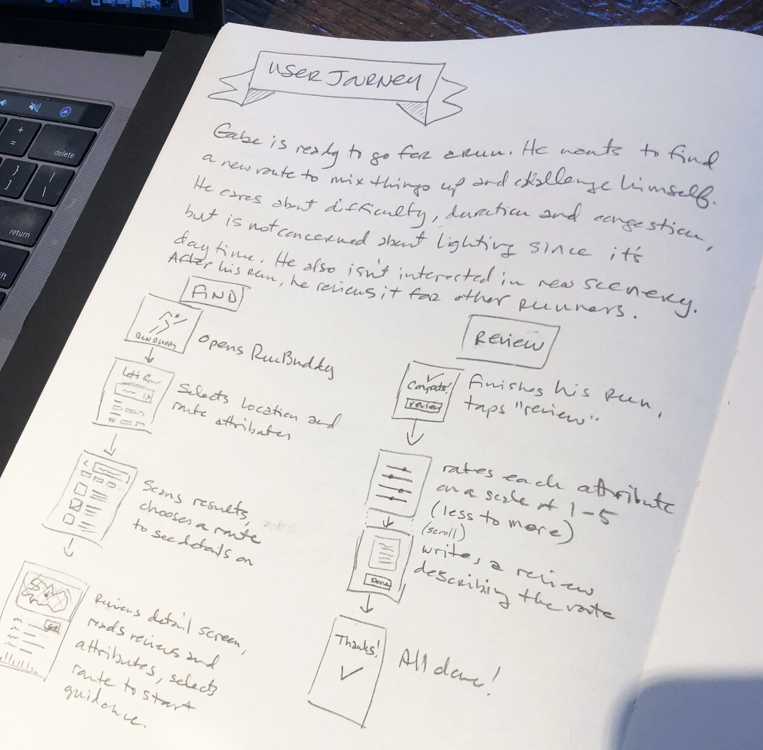
User Journey
Gabe is ready to go for a run. He wants to find a new route to mix things up a bit, and to challenge himself. He cares about difficulty level, distance and congestion, but is not concerned about lightning since it is daytime. He’s also not concerned about remoteness, or scenery. After his run, he likes to review the route for other runners like him.
Need
He opens RunBuddy, and selects a location and route attributes.
Consideration
He scans the results, selects a route to see more details on. He reviews the details screen of a particular route, and reads the user reviews.
Decision
Deciding on a route for his run, he starts the turn-by-turn guidance.
Reviewing
He finishes his run, and and taps the Review button. He rates each attribute on a scale of 1-5 (less to more). He continues on to write a review of the route, describing any additional details, obstacles, or observations, taps on Done, and goes home to shower.
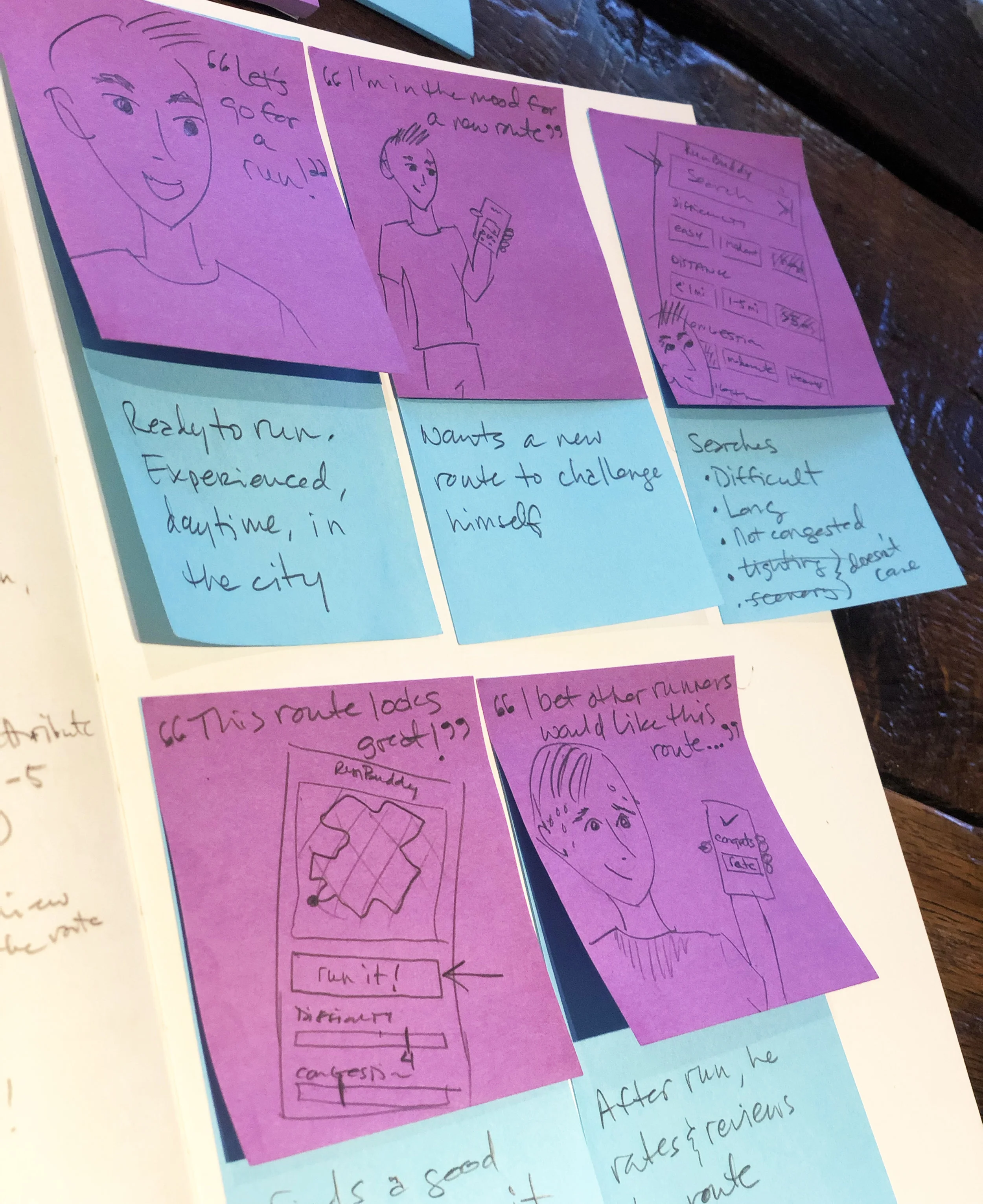
(As a visual person, I often use sketch notes to help me connect further to the user's problem and journey.)
Rough Sketches
Next, I started generating ideas for the features and layout of the main flow, which shows a user searching for a new run route based on specific attributes, selecting a route, and reviewing the route after he finishes his run.
Here are a few concepts which I wanted to explore further:
1-5 rating of common attributes, rather than a star-based rating system which is subjective, and not detailed enough
Attribute tags (filters), on the search screen
Ability to quickly and easily see a route’s attributes throughout the process
Heat mapping the route graphic so users can see the points where the route difficult increases or decreases.
Refined Sketches
I then refined the sketches into something more detailed, with a consolidated UI combining the key features I had hashed out in the previous round of sketching. I also highlighted interactions throughout the user journey.
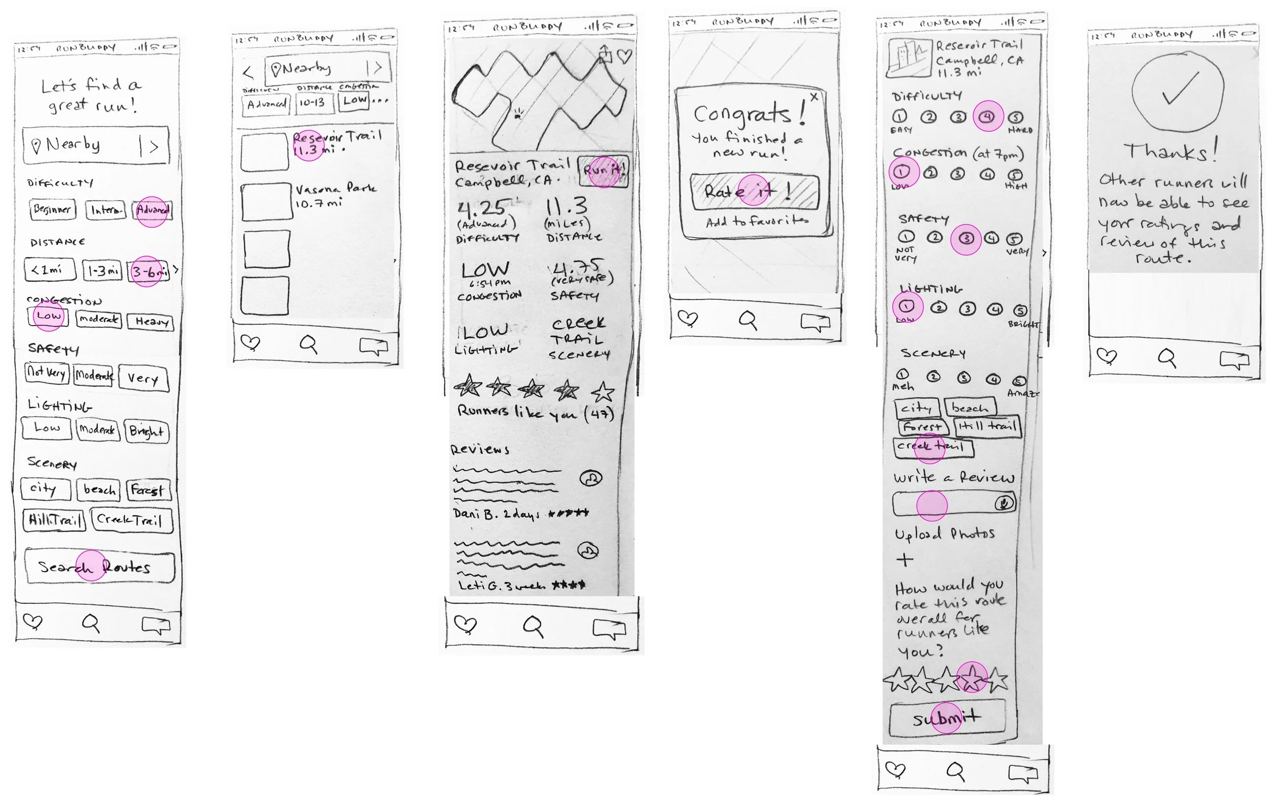
Wireframes
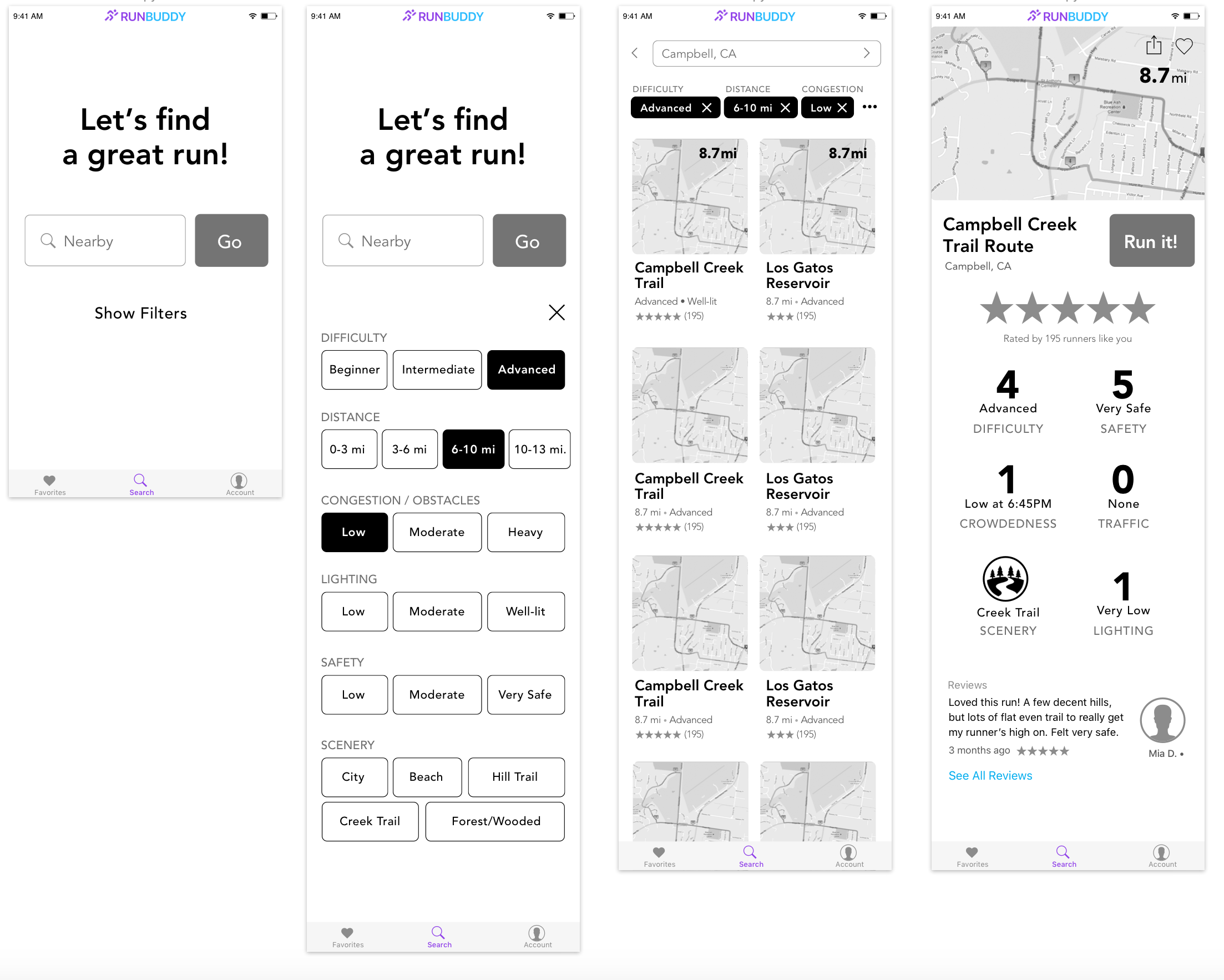
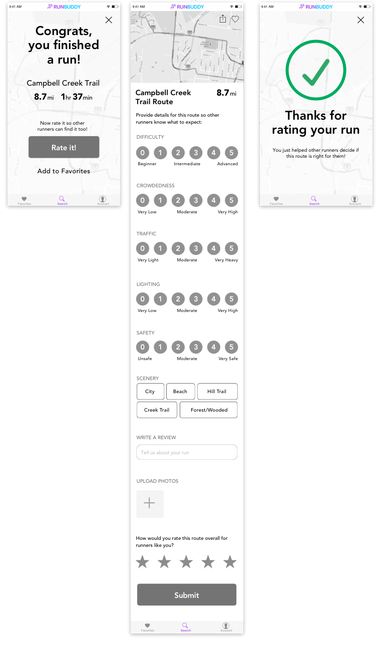
Once the designs were validated, I digitized the screens. I began to add small interactions, like expanding the filters. At this point, I was able to get a much better idea of space and layout, before moving on to high fidelity mockups.
High fidelity mockups
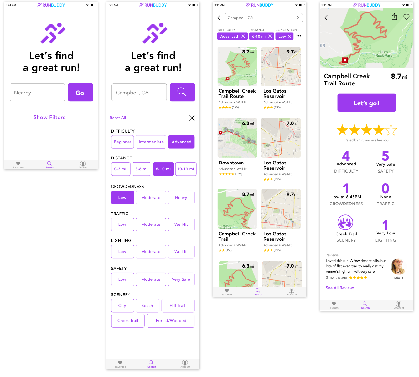
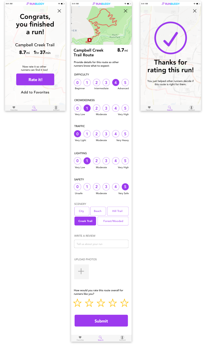
Next, the designs were brought to life and further refined by adding color, iconography, font treatments, and spacing.
Logo & app icon design
As a final step, I designed a logo for RunBuddy, and applied it to an iOS app icon at various sizes.
Summary and next steps
This fun, simple UX exercise was a personal development project, a refreshing break from the highly complex and strongly corporate-branded projects I work on at Apple. We have experts in things like research and prototyping on our design team, so I rarely get a chance to get hands-on in those areas... this was a great way to flex those underused muscles!
Also, since I can't show any of my design work from the time I've been at Apple (8 years as I'm writing), I spend time on personal development projects, which allow me to demonstrated the breadth of my design skills, if not necessarily always the depth :)
As next steps in this project, I would:
• make a hi-fi prototype with additional features such as creating a run, favoriting, and writing a review
• add more details to the route detail screen, such as an elevation chart
• collaborate with developers along the way to ensure technical feasibility, and with stakeholders to keep on track with business goals.
• design an Apple Watch companion app so runners can follow guidance and rate runs without their phone on hand


